Where founders learn to exit.
01 — Channel
Your brand, on your channel.
The whole system in its habitat — banner, avatar, and thumbnails as they’d sit on your YouTube home. This is the promise made concrete.
 How I’d sell a SaaS in 2026 18:24
  The multiple myth 12:09
  What acquirers actually want 21:37 Exit-ready in 90 days 15:02
 Placeholder avatar + thumbnails — swap for the real headshot and cover art. Thumbnail titles show the house style: one honey-italic payoff word.
02 — Color
Warm desert, one cool note.
Neutrals do the reading. One primary carries the brand. A single cool accent — lagoon, used once, like the sea.
Neutrals
The canvas. Umber grounds everything; sand reads; dune fills the space between.
Primary
The warmth. Terracotta carries the brand; honey lands the one emphasised word.
Accent
The one cool note — used once.
03 — Type
Canela headlines, Avenir body.
Canela carries the headlines — a high-contrast display serif, cinematic and editorial. Avenir Next does the reading. Emphasis is a single Canela italic word, in amber.
Body · UI
Avenir Next
Multiples are a story, not a number.
Light, modern, unhurried.
Body copy, captions, UI, data labels.
Emphasis
Canela italic
The number most founders miss.
Italic for the word that lands.
Used only for the emphasised word.
Signature pairing
the number most founders miss
Canela sets the headline; Avenir Next carries the body; the emphasis word is Canela italic in amber.
04 — Voice
The seasoned dealmaker.
Selling Startups sounds like someone who has actually sat at the table — calm, precise, a little contrarian. Authority without the hype. We talk with founders, never pitch at them.
Plain-spoken
Say the real thing. No jargon for its own sake. If a sentence needs a buzzword to sound smart, cut it.
Earned authority
We’ve done the deals. State it once, clearly, and move on. Confidence doesn’t shout.
Quietly contrarian
We challenge the default — multiples are a story — without raising our voice.
Respectful
An exit is years of someone’s life. We honour the work behind the number.
Where founders learn to exit.
Multiples are a story, not a number.
You’re not selling a product. You’re selling a future someone else gets to run.
Sounds like — not like
We say Where founders learn to exit.
Not Crush your exit & 10x your valuation 🚀
We say Here’s how deals actually close.
Not The SECRET nobody tells you!!!
We say Multiples are a story.
Not Use this hack to triple your multiple
Words we use
Words we avoid
05 — Photography
Shot like a film, not a feed.
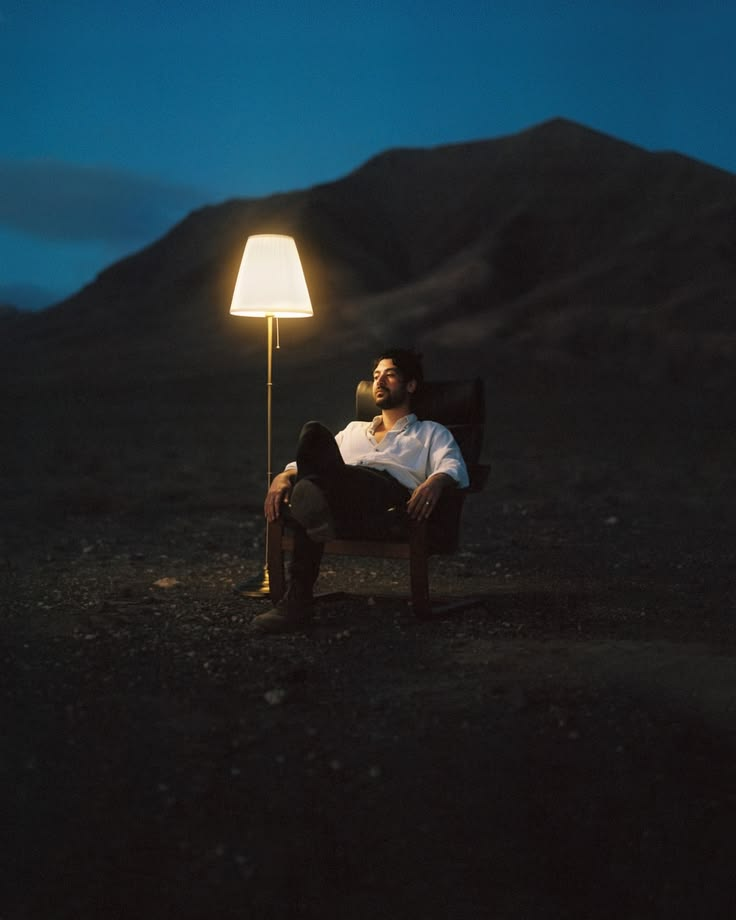
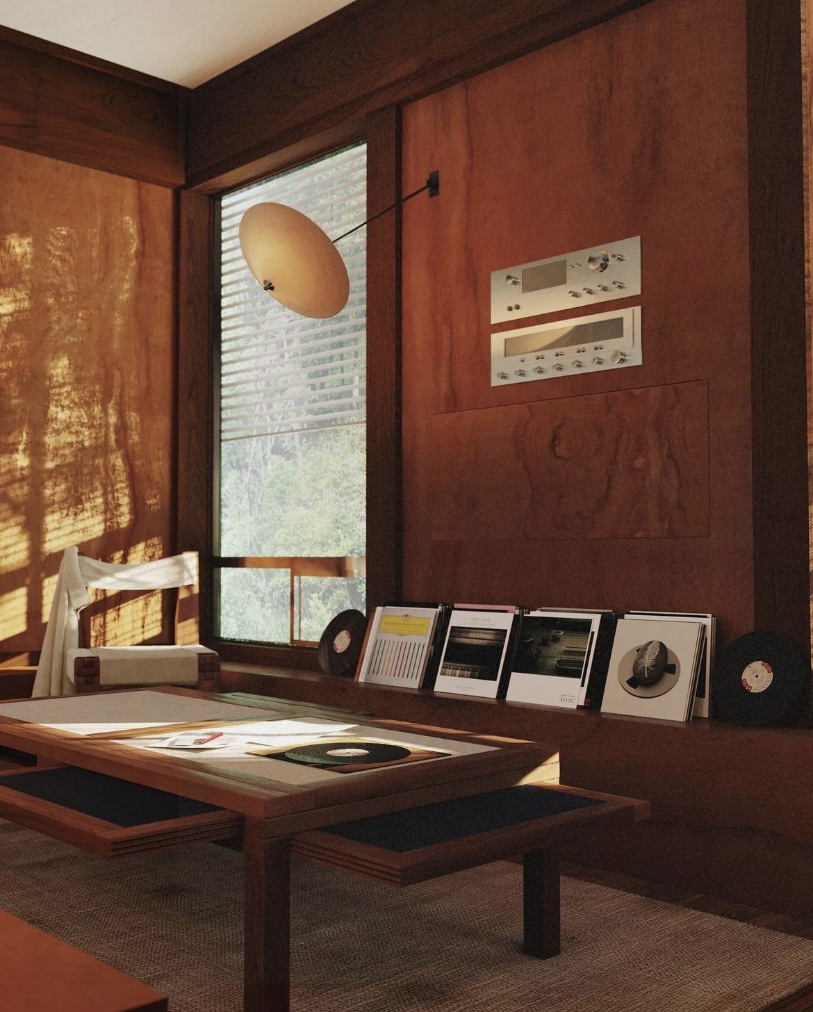
Every frame should read like a still from a film — warm dusk light, one subject, room to breathe. Mediterranean stone and linen, a golden grade, quiet luxury. Restraint over energy.
The grade
Warm, lifted, golden — the look every frame lands on.
The grade
Drag to compare. LOG protects the highlights and reads flat; the grade lifts the shadows, warms the mids, and lands the golden, cinematic look. The DaVinci PowerGrades that produce this are in Downloads.
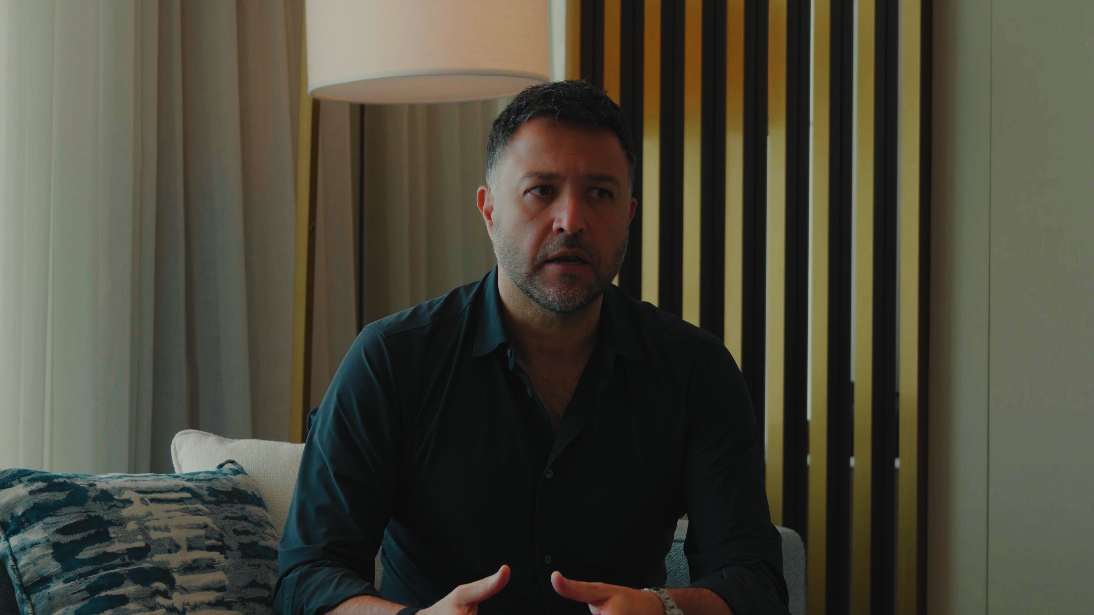
Front shot

Warm key on the face, a single lagoon note on the shelf, shadows held deep and clean.
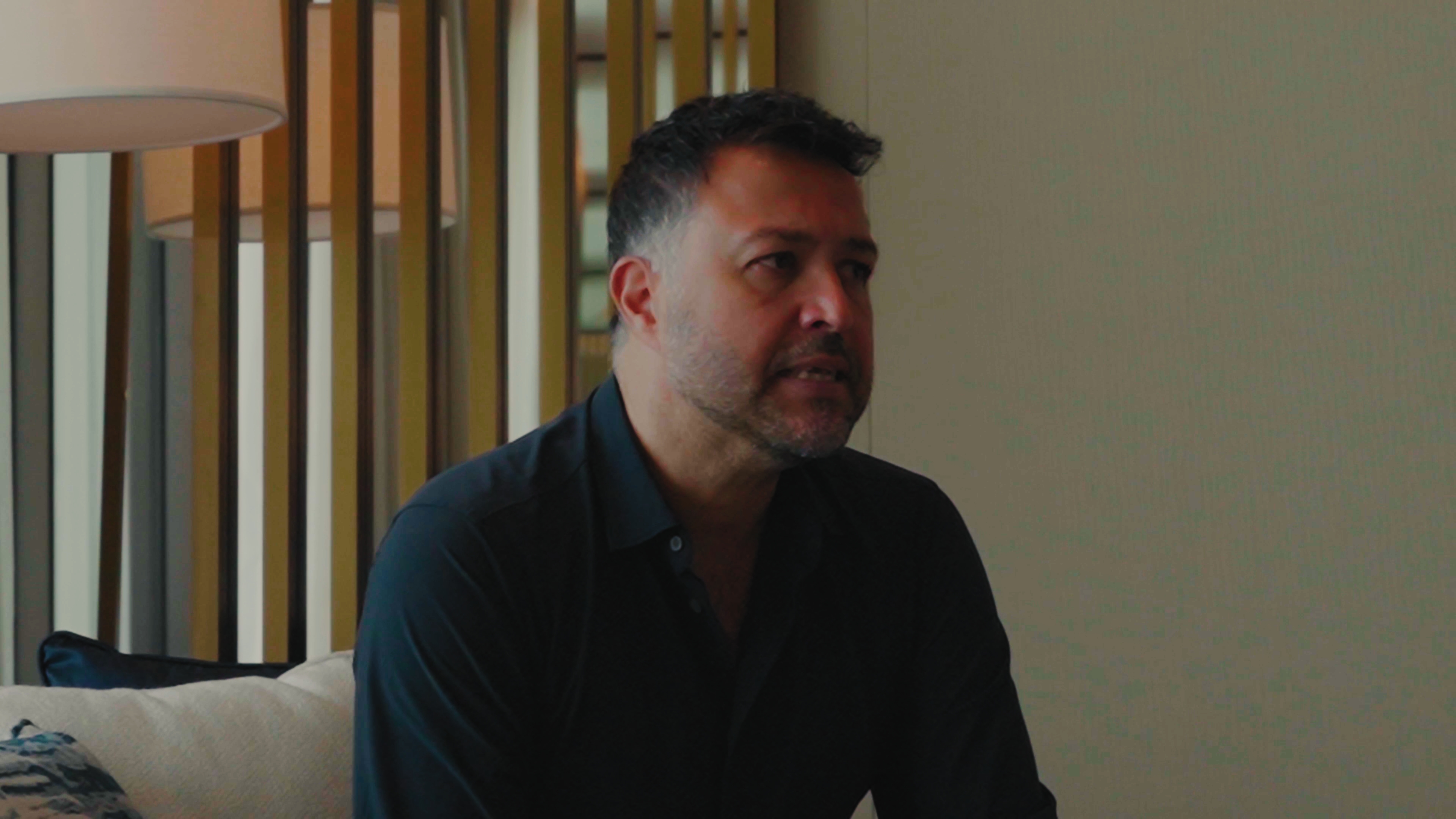
Side shot

Brass-lamp glow, golden falloff across the wall, blacks lifted just off the floor.
What makes a shot on-brand
Light
Golden hour or blue hour. One warm source. Long shadows, lifted blacks — never flat midday.
Space
Give it room. One subject, generous negative space. If it feels crowded, pull back.
Palette
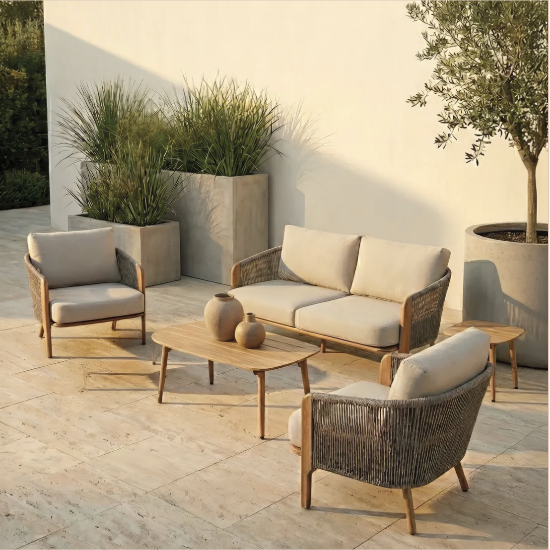
Warm neutrals — sand, teak, travertine, umber. One deep note: terracotta, oxblood, or a cool lagoon.
Setting
Mediterranean / Gulf. Linen, stone, wood, water. Quiet luxury — expensive and calm, never flashy.
Mood
Cinematic and still. It should feel like a held breath, not a scroll-stopper.
On the page
Shoot wide — let the subject breathe in the frame.
Warm grade: golden highlights, soft contrast, lifted shadows.
One hero object or one person per frame.
Cool / clinical white-balance or flat midday light.
Busy, cluttered backgrounds.
Oversaturated, high-contrast "punchy" grades.
06 — On-screen graphics
Text & graphics, on your footage.
How words sit on the video. Avenir Next light does the reading; one Canela-italic word in honey carries the weight. Restraint over noise — every graphic leaves room to breathe.
01 Caption
Avenir Next Light, centered in the lower third. The payoff word — sold, exit, acquired — set in Canela italic, honey. For spoken-line emphasis.
02 Subtitle
Plain Avenir Next Light, centered lower third, no accent. Running burned-in captions and quiet asides.
03 Title card
Cinematic title card — letterbox bars, a warm vignette, the name in small caps above the line. Cold opens and chapter breaks. Drop a darkened still behind it for extra weight.
04 Cinematic crop
2.39:1 letterbox — black bars top and bottom, as if shot on film. For montages and b-roll. Shoot 16:9, crop to scope in the edit; keep the action in the middle band.
05 Speaker ID
Name in Canela (first name italic, honey); role in Avenir uppercase beneath. Bottom-left over a soft scrim. First appearance only.
06 Topic card
A small lowercase Avenir kicker over an oversized Canela-italic word in honey. Chapter and topic markers.
07 — Layouts
Photos and graphics, composed.
Beyond captions on footage — how a photo and a few words share a frame. Three patterns for slides, thumbnails, and posts. Always one idea, always room to breathe.
modern luxury
Simplicity sells
give it space

08 — Downloads
Grab the grade.
The cinematic look, ready to drop into your edit. DaVinci Resolve PowerGrades for the front and side interview setups — the exact grades behind the before / afters above.
Front shot — PowerGrade
DaVinci Resolve .drx still for the front interview look. In the Color page: right-click the Gallery → Import, then drag the still onto your clip.
Download .drx →Side shot — PowerGrade
DaVinci Resolve .drx still for the side / profile angle. The same warm, lifted grade, tuned for the brass-lamp side light.
Download .drx →Quick-copy palette
The five colours, one tap to the clipboard.